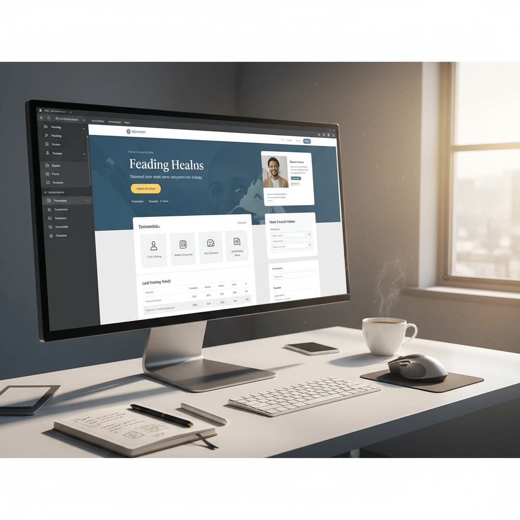
Create WP Websites in hours, not days
Explore 650+ designed components and template kits

In the fast-paced digital landscape of 2026, a static website is a missed opportunity. Your landing pages are the virtual storefronts to your business...
In the fast-paced digital landscape of 2026, a static website is a missed opportunity. Your landing pages are the virtual storefronts to your business, and if they aren’t optimized for conversions, you’re leaving money on the table. With the rise of sophisticated user expectations and AI-powered design tools, it’s more crucial than ever to master the art of conversion-focused Elementor landing page design.
This guide provides actionable strategies to revamp your Elementor landing pages for maximum impact. We’ll explore everything from understanding your audience to crafting compelling copy, ensuring your pages not only attract visitors but also turn them into loyal customers. Let’s dive in and transform your landing pages into conversion powerhouses, potentially aided by something like Elementor AI: Automate Your Website Design Workflow.
In 2026, users expect seamless, personalized, and lightning-fast experiences. Short attention spans demand instant gratification; if your landing page doesn’t immediately capture their interest and demonstrate value, they’ll bounce. Mobile-first indexing is no longer a trend but the standard, so responsiveness across all devices is non-negotiable. Accessibility is also paramount, ensuring your landing page is usable by individuals with disabilities. Furthermore, users are increasingly savvy, able to differentiate genuine value from marketing fluff. Trust is earned through transparency, social proof, and a focus on solving their problems.
Consider implementing features like personalized content based on user location or browsing history. Optimize images and code to ensure a sub-3-second loading time. Prioritize clear navigation and intuitive design. Moreover, adopt a user-centric design approach, focusing on anticipating and fulfilling their needs. Failure to meet these heightened expectations will inevitably lead to lower conversion rates and lost opportunities.
Your landing page is often the first interaction a potential customer has with your brand. A well-designed landing page can significantly impact your return on investment (ROI). A conversion-focused design guides users seamlessly through the sales funnel, encouraging them to take desired actions like signing up for a newsletter, requesting a demo, or making a purchase. Every element on the page, from the headline to the call-to-action button, should be strategically placed and optimized to maximize conversions. A/B testing various design elements, such as button colors, headline variations, and image placements, is crucial for identifying what resonates best with your target audience. Improving the conversion rate by even a small percentage can translate to substantial revenue gains.
Cluttered layouts, slow loading times, and generic stock photos are conversion killers. Outdated design trends like excessive animations, auto-playing videos (without user control), and walls of text overwhelm and frustrate visitors. Dated design choices signal a lack of attention to detail and can erode trust. Furthermore, failing to optimize for mobile devices alienates a significant portion of your audience. Avoid using outdated visual metaphors or clichés. Regularly analyze your website analytics to identify and address any design elements that are hindering conversions. A good way to stay on top of these changes may be with AI insights, as discussed in 2026’s Best AI Tools for Elementor Website Design.
A user persona is a semi-fictional representation of your ideal customer, based on research and data about your existing and prospective customers. It goes beyond basic demographics to include motivations, goals, pain points, and behaviors. Create personas based on in-depth interviews, surveys, and website analytics. Give each persona a name, a background, and a story. This allows you to empathize with your target audience and design landing pages that resonate with their specific needs and desires. For instance, a user persona for a SaaS product might be “Marketing Manager Maya,” who is struggling to improve lead generation and is looking for an easy-to-use solution.
Use these personas to inform every aspect of your landing page design, from the messaging to the visuals. Consider their preferred language, tone of voice, and the types of content they find most engaging. The more detailed and accurate your user personas, the more effective your landing pages will be.
Your landing page should directly address the pain points of your target audience. Identify the problems they are trying to solve and showcase how your product or service can help them overcome those challenges. Use compelling headlines and concise copy to highlight the key benefits and solutions. For example, if your target audience is struggling with time management, your headline could be “Reclaim Your Time: The Ultimate Productivity Tool.” Use testimonials and case studies to demonstrate how you have helped other customers overcome similar challenges. Don’t just focus on the features of your product or service; emphasize the tangible benefits and outcomes.
Website analytics provide valuable insights into how users interact with your landing page. Track key metrics such as bounce rate, time on page, conversion rate, and click-through rate. Use tools like Google Analytics or other platforms to identify areas where users are dropping off or experiencing friction. Analyze heatmaps to understand where users are clicking and scrolling. A/B test different design elements and copy variations to determine what performs best. Continuously monitor your analytics and make data-driven decisions to optimize your landing page for maximum conversions. Remember that optimization is an ongoing process, not a one-time task.
Your headline is the first thing visitors see, making it crucial to grab their attention immediately. A compelling headline should be clear, concise, and benefit-driven. It should directly address the user’s needs and promise a solution to their problem. Use strong action verbs and emotional language to create a sense of urgency and excitement. Test different headline variations to see which ones resonate best with your target audience. Avoid using generic or vague headlines that don’t clearly communicate the value proposition. For example, instead of “Welcome to Our Website,” try “Double Your Leads with Our Proven Marketing Strategies.”
Visuals play a critical role in creating a positive first impression and capturing the user’s attention. Use high-quality images and videos that are relevant to your product or service. Avoid using generic stock photos that look unnatural or unauthentic. Showcase your product in action or demonstrate its benefits through engaging visuals. Optimize your images for web to ensure fast loading times. Consider using infographics or illustrations to communicate complex information in a visually appealing way. A well-designed visual can convey more information in seconds than a lengthy paragraph of text.
Your call-to-action (CTA) is the most important element on your landing page, as it guides users towards the desired action. Place your primary CTA above the fold, where it is immediately visible to visitors. Use a clear and concise CTA that tells users exactly what you want them to do, such as “Get Started Now,” “Download Your Free Guide,” or “Request a Demo.” Make your CTA button visually prominent by using a contrasting color and a clear font. Use action-oriented language that encourages users to click. Test different CTA variations to see which ones generate the highest conversion rates. Ensure the CTA links to the correct page or form and functions flawlessly on all devices.
Focus on the benefits, not just the features. Instead of saying “Our software has advanced analytics,” say “Gain actionable insights to improve your marketing ROI.” Clearly articulate the value proposition and how it directly addresses the user’s pain points. Use strong verbs and compelling language to create a sense of excitement and urgency. Keep your copy concise and easy to read, avoiding jargon or technical terms that your target audience may not understand. Break up large blocks of text with bullet points, headings, and subheadings to improve readability. Highlight the key benefits in bold or italics to draw attention to them. Show, don’t just tell, what the user will gain.
Social proof is a powerful tool for building trust and credibility. Include testimonials from satisfied customers, showcasing their positive experiences with your product or service. Display customer reviews and ratings to demonstrate the social validation of your offering. Feature case studies that highlight the tangible results you have achieved for other clients. If you have any awards or certifications, display them prominently on your landing page. Use logos of well-known clients or partners to further enhance your credibility. Ensure that your social proof is authentic and verifiable, avoiding fake testimonials or misleading claims. Genuine social proof can significantly increase conversion rates.
Urgency can be a powerful motivator for driving conversions. Create a sense of urgency by using time-sensitive offers, limited-time discounts, or scarcity tactics. For example, you could say “Offer ends in 24 hours” or “Only 10 spots left.” Use countdown timers to visually reinforce the sense of urgency. Avoid using false scarcity or deceptive tactics, as this can damage your credibility. Make sure your offer is genuine and that you can deliver on your promises. A well-crafted sense of urgency can encourage hesitant visitors to take action and convert into customers. Ensure that your sales and landing page are both SEO-optimised, which can be learnt about on blogs such as Content Marketing ROI: A Business Owner’s AI Guide.
In 2026, a mobile-first approach is not just a recommendation; it’s a necessity. More users access the internet via mobile devices than desktops, meaning your landing page must be optimized for smaller screens. Neglecting mobile users can severely impact your conversion rates. A mobile-first design prioritizes the mobile experience and then scales up for larger screens. This ensures that the core message and functionality are easily accessible, regardless of the device used.
Elementor makes responsive design relatively straightforward. Use Elementor’s responsive mode to preview your landing page on different screen sizes (desktop, tablet, mobile). Adjust element sizes, spacing, and visibility to ensure optimal viewing on each device. For instance, you might reduce font sizes on mobile, stack columns vertically instead of horizontally, or hide certain non-essential elements. Decision criteria: page load speed (aim for under 3 seconds on mobile), readability (font sizes no smaller than 16px), and tap target size (at least 44×44 pixels for buttons and links). Avoid horizontal scrolling, which creates a frustrating user experience. Example: A hero image that looks great on desktop might be cropped poorly on mobile. Use Elementor’s settings to upload different versions of the image optimized for each device.
A mobile-friendly layout is characterized by a single-column structure, clear headings, and concise content. Users should be able to easily scroll through the page and find the information they need. The navigation should be simple and intuitive, typically a hamburger menu or a simplified tab bar. Actionable steps: Simplify your navigation menu to only essential links. Use clear and concise headings to break up the content. Reduce the amount of text on each page to avoid overwhelming users. Ensure that buttons and links are large enough to be easily tapped on a touchscreen. Example: A landing page with too many columns on mobile will force users to zoom in and out, resulting in a poor user experience. Stick to a single-column layout for easier reading.
Large, unoptimized images and videos can significantly slow down page load times on mobile devices. This leads to a higher bounce rate and lower conversion rates. Use image optimization tools to compress images without sacrificing quality. Choose the right image format (JPEG for photos, PNG for graphics) and resize images to the appropriate dimensions for mobile devices. For videos, consider using a video hosting platform like YouTube or Vimeo and embedding the video on your landing page. This reduces the load on your server and ensures that the video is streamed efficiently. Actionable step: Compress all images using tools like TinyPNG or ImageOptim. Use responsive images (<picture> element or Elementor’s responsive image settings) to serve different image sizes based on the device. Example: A 5MB image on a desktop monitor might be a 200KB image on a mobile phone without visible loss of quality. Consider using WebP format for superior compression. More information can be found from sources discussing WebP optimization.
Visual hierarchy is the arrangement of elements on a page to guide the user’s eye to the most important information first. A well-defined visual hierarchy makes it easy for users to scan the page and understand the key message. Without a clear hierarchy, users may feel overwhelmed and leave without converting. Key elements such as headlines, subheadings, images, and calls to action should be strategically placed and styled to stand out from the rest of the content.
Size, color, and contrast are powerful tools for creating visual hierarchy. Larger elements naturally attract more attention. Use larger fonts for headlines and subheadings to create a clear visual distinction from body text. Color can be used to highlight important elements, such as calls to action, or to create a visual theme. Contrast is essential for making elements stand out. Use high contrast between text and background to improve readability. Decision criteria: headlines should be visually prominent, CTAs should contrast strongly with the surrounding elements, and key benefits should be highlighted with color or size. Example: A bright, contrasting button against a muted background will draw the user’s eye to the call to action. Conversely, using similar colors for the button and the background will make it blend in and be easily missed.
Visual flow is the path that the user’s eye follows as they scan the page. Use visual cues, such as arrows, lines, and whitespace, to guide the user’s eye towards your call to action. The placement of elements on the page can also influence visual flow. For example, placing an image of a person looking towards the CTA will naturally draw the user’s eye in that direction. Actionable steps: Use directional cues to guide the eye. Place the most important information above the fold. Use whitespace to create breathing room around important elements. Ensure that the CTA is easily visible and accessible. Example: A landing page with a long, scrolling format should have multiple CTAs strategically placed throughout the page to capture users at different points in their journey.
Visual clutter is anything that distracts from the main message of the landing page. This can include excessive animations, irrelevant images, or too much text. A cluttered landing page can overwhelm users and make it difficult for them to find the information they need. Keep the design clean and simple, focusing on the essential elements. Use whitespace to create breathing room around elements and avoid using too many colors or fonts. Pitfalls: too many animations can slow down the page and distract users. Too many fonts create a jarring and unprofessional look. Actionable step: Audit your landing page for unnecessary elements and remove them. Use a minimalist design approach with plenty of whitespace. Master Elementor to gain control over design elements. Example: A landing page with flashing banners, auto-playing videos, and multiple competing calls to action will likely confuse users and reduce conversion rates.
Forms are a critical part of many landing pages, used for lead generation, sign-ups, and purchases. However, long and complex forms can deter users from completing them, leading to lower conversion rates. Optimizing form fields is essential for maximizing conversions. The principle of “less is more” is particularly relevant here. The fewer fields you require, the higher the completion rate is likely to be.
Every additional form field adds friction to the conversion process. Ask yourself: is this information absolutely necessary? Can it be obtained later, or is it needed upfront? Prioritize essential information such as name, email address, and perhaps one or two key qualifying questions. Avoid asking for unnecessary details like phone number (unless it’s crucial for the offer), address, or company size (if not directly relevant). Decision criteria: only ask for information that is directly relevant to the offer. Use progressive profiling to collect additional information over time. Consider using social login options to pre-populate form fields. Example: Instead of asking for both “First Name” and “Last Name,” consider using a single “Full Name” field. This simplifies the form and reduces the perceived effort required.
Ambiguous or unclear labels can confuse users and lead to errors or abandonment. Ensure that each form field has a clear and concise label that accurately describes the information being requested. Use placeholder text to provide additional context or examples. Avoid using jargon or technical terms that users may not understand. Actionable steps: Use clear and descriptive labels. Place labels above the form fields (rather than inside). Use placeholder text to provide examples or additional context. Example: Instead of using a generic label like “Info,” use a more specific label like “Email Address” or “Phone Number.” Avoid using placeholder text as a substitute for labels, as it disappears when the user starts typing.
Error messages are inevitable, but they don’t have to be frustrating. Provide clear and helpful error messages that explain what went wrong and how to fix it. Avoid generic error messages like “Invalid input.” Instead, provide specific guidance, such as “Please enter a valid email address” or “Password must be at least 8 characters long.” Display error messages inline, next to the affected field, so users can quickly identify and correct the problem. Actionable steps: Provide specific and helpful error messages. Display error messages inline, next to the affected field. Use visual cues, such as red borders or icons, to highlight errors. Example: Instead of simply saying “Error,” the message could say, “Your email address is missing an @ symbol. Please check your entry.” Ensure your error messages are easily visible on mobile devices.
A/B testing (also known as split testing) is a crucial process for optimizing your Elementor landing page. It involves creating two or more variations of your landing page and testing them against each other to see which performs best. By analyzing the results, you can make data-driven decisions to improve conversions and achieve your desired goals. Without A/B testing, you are relying on guesswork, which is often inaccurate.
Elementor may have built-in A/B testing features depending on the version (check Elementor’s documentation for 2026 features). Alternatively, numerous third-party plugins integrate seamlessly with Elementor to provide A/B testing functionality. Popular options include Google Optimize (although deprecated, alternatives are available), and dedicated WordPress A/B testing plugins. These plugins allow you to easily create variations of your landing page, track key metrics, and analyze the results. Pitfalls: Ensure that the A/B testing tool integrates properly with Elementor. Choose a tool that tracks the metrics that are most important to you. Actionable step: Research and select an A/B testing tool that meets your needs and budget. Install and configure the tool on your WordPress website. Consider Elementor AI‘s potential A/B testing capabilities. Example: Using a plugin, you can create two versions of your landing page, one with a red CTA button and one with a green CTA button, and test which button color generates more clicks.
A/B testing can be used to test a wide range of elements on your landing page, including headlines, CTAs, images, videos, form fields, and even the overall layout. Start by testing the elements that are most likely to have a significant impact on conversions. Headlines are often the first thing users see, so testing different headlines can be a good starting point. CTAs are the final step in the conversion process, so testing different CTA copy, colors, and placement can also be effective. Visuals, such as images and videos, can also have a significant impact on engagement and conversions. Decision criteria: Test one element at a time to isolate the impact of each change. Prioritize testing elements that are most likely to have a significant impact. Use clear and measurable goals for each test. Example: Test different variations of your headline, such as “Get a Free Quote Today” versus “Request a Personalized Quote Now.”
Once you’ve run your A/B tests, it’s important to analyze the results and make data-driven decisions to improve conversions. Look at the key metrics, such as conversion rate, bounce rate, and time on page, to see which variation performed best. Use statistical significance to ensure that the results are reliable. Don’t be afraid to iterate and test multiple variations until you find the optimal combination. Remember that A/B testing is an ongoing process. Actionable steps: Track key metrics for each variation. Use statistical significance to determine the winning variation. Implement the changes from the winning variation on your live landing page. Continuously test and iterate to further improve conversions. Example: If the variation with the green CTA button generated a 20% higher conversion rate with statistical significance, implement the green CTA button on your live landing page and continue testing other elements to further optimize your landing page. Consider the role of 2026’s Best AI Tools in analyzing A/B test results for faster insights.
Landing page speed directly impacts conversion rates. Slow loading times lead to higher bounce rates and lost opportunities. Potential customers are impatient; if your page doesn’t load quickly, they will likely leave and seek alternatives. Studies show that even a one-second delay can reduce conversions significantly. Optimizing for speed is not just a technical consideration; it’s a crucial part of creating a positive user experience and maximizing your ROI. You should aim for a load time of under three seconds, ideally under two. Tools like Google PageSpeed Insights and GTmetrix can help you identify performance bottlenecks and provide actionable recommendations.
Large image and video files are a major culprit behind slow loading times. Before uploading any media, ensure it’s properly compressed without sacrificing too much visual quality. Use image optimization tools like TinyPNG or ImageOptim to reduce file sizes by up to 70% without noticeable loss of quality. For videos, consider using a service like Vimeo or YouTube and embedding the video on your landing page instead of hosting it directly on your server. When embedding, be sure to use lazy loading to prevent the video from loading until it’s visible in the viewport. This simple step can significantly improve initial page load time. Choosing the right image format is also key. Use WebP for superior compression and quality, or JPEG for photos, and PNG for graphics with transparency. Ensure all images are properly sized for their display area; there’s no point in loading a 2000px wide image if it’s displayed at 500px.
Caching plugins create static versions of your landing page, reducing the load on your server and speeding up delivery to visitors. When a user visits your page for the first time, the server processes all the code and data to generate the page. With caching, this process only happens once. Subsequent visitors are served the cached version, which loads much faster. Popular caching plugins for WordPress include WP Rocket, LiteSpeed Cache, and W3 Total Cache. Configure your caching plugin to automatically clear the cache when you update your landing page to ensure visitors always see the latest version. Experiment with different caching settings to find the optimal configuration for your specific hosting environment and landing page design. Regularly test your page speed after implementing caching to verify its effectiveness. Remember to also leverage browser caching to store static assets on the user’s computer for even faster subsequent visits.
While animations and effects can enhance the visual appeal of your landing page, they can also negatively impact performance if not used judiciously. Excessive or poorly optimized animations can consume significant processing power and slow down the page. Stick to subtle, purposeful animations that enhance the user experience without being distracting. Avoid using complex animations that require a lot of processing power, especially on mobile devices. Optimize your animations using CSS transitions and transforms, which are generally more performant than JavaScript-based animations. Test your landing page on different devices and browsers to ensure animations are smooth and don’t cause performance issues. If you need to use JavaScript for animations, ensure the code is well-optimized and doesn’t block the main thread. Consider using a performance monitoring tool to identify animations that are causing performance bottlenecks and optimize them accordingly.
Analyzing successful landing pages provides valuable insights into what works and what doesn’t. By studying real-world examples, you can identify common design patterns, effective copywriting techniques, and persuasive calls to action. However, remember that every audience is different, so what works for one company may not work for another. The goal is to learn from these examples and adapt them to your specific needs and target audience. Consider factors like industry, target demographic, and the specific goals of the landing page when evaluating case studies. This will help you identify the most relevant lessons and apply them effectively to your own Elementor landing page designs.
Successful landing pages share common characteristics, regardless of the industry they serve. They typically feature a clear and concise headline, compelling visuals, persuasive copy, and a prominent call to action. However, the specific implementation of these elements can vary significantly depending on the industry and target audience. For example, a landing page for a SaaS product might focus on showcasing its features and benefits, while a landing page for an e-commerce product might emphasize visual appeal and product demonstrations. Analyzing landing pages from various industries can expose you to different approaches and help you identify innovative ideas that you can adapt to your own designs. Tools like Ahrefs or Semrush can help you find top-performing landing pages in specific niches. Consider how these pages address their target audience’s pain points and showcase the value proposition of their offerings.
Several design elements contribute to the success of a landing page. These include a clear and concise value proposition, a visually appealing layout, high-quality images and videos, and a strong call to action. The value proposition should immediately communicate the benefits of your offering to the visitor. The layout should be clean and uncluttered, guiding the user’s eye towards the call to action. Images and videos should be high-quality and relevant to the content. The call to action should be prominent and persuasive, encouraging visitors to take the desired action. Pay close attention to the use of color, typography, and white space, as these elements can significantly impact the overall user experience. For example, contrasting colors can draw attention to key elements, while clear and legible typography can improve readability. White space can help to create a sense of balance and prevent the page from feeling cluttered.
Once you’ve analyzed successful landing pages and identified the key design elements that contribute to their success, the next step is to apply these lessons to your own Elementor landing page. Don’t simply copy the designs you’ve seen; instead, adapt them to your specific needs and target audience. Start by clearly defining the goals of your landing page and identifying your target audience’s pain points. Then, create a wireframe or mockup of your landing page, incorporating the design elements you’ve learned from your research. Use Elementor’s drag-and-drop interface to easily build and customize your landing page. A/B test different versions of your landing page to identify the most effective designs. Use analytics to track key metrics such as conversion rate, bounce rate, and time on page to measure the performance of your landing page and identify areas for improvement. Refine your landing page over time based on the data you collect.
Creating a high-converting landing page from scratch can be time-consuming. CopyElement offers a library of pre-designed templates specifically built for Elementor, which can significantly accelerate the design process. These templates are designed by professionals with a focus on conversion optimization. This allows you to quickly create stunning and effective landing pages without starting from a blank canvas. By leveraging these templates, you can focus on customizing the content and tailoring the design to your specific brand and target audience. Consider CopyElement templates a starting point for your design, saving you valuable time and effort.
CopyElement offers a diverse range of conversion-focused templates designed for various industries and purposes. These templates are not just visually appealing; they are also strategically designed to guide visitors towards taking the desired action. Whether you need a landing page for lead generation, product sales, or event registration, you’ll find a template that suits your needs. Some examples include templates optimized for e-commerce stores, featuring prominent product showcases and clear calls to action, and templates designed for service businesses, highlighting testimonials and service offerings. Each template is designed with a specific conversion goal in mind, ensuring that your landing page is optimized for success. [Example: Imagine a SaaS company, “CloudSync,” uses a CopyElement template to increase free trial signups. The template features a compelling headline, a short explainer video, and a prominent call-to-action button. After implementing the template and customizing the content, CloudSync sees a 35% increase in free trial signups.]
CopyElement templates are designed to be easily customizable within Elementor’s intuitive drag-and-drop interface. You can easily change the colors, fonts, images, and text to match your brand and messaging. Elementor’s visual editor allows you to see the changes in real-time, making it easy to experiment with different design options. Simply drag and drop elements to rearrange the layout, or add new sections and widgets to further customize the template. Elementor’s responsive design features ensure that your landing page looks great on all devices. You can adjust the layout and styling for different screen sizes to create a seamless user experience across desktop, tablet, and mobile. The ability to easily customize CopyElement templates gives you the flexibility to create a unique and effective landing page without the need for coding or advanced design skills. Check out “Master Elementor: Build Websites Visually, No Code” => https://blog.copyelement.com/master-elementor-build-websites-visually-no-code/, for more information on how to leverage Elementor.
CopyElement templates are not only visually appealing and conversion-focused, but they are also designed with performance and SEO in mind. The templates are built using clean, optimized code that loads quickly and efficiently. This improves the user experience and helps to boost your search engine rankings. The templates are also designed to be mobile-friendly, ensuring that your landing page looks great on all devices and meets Google’s mobile-first indexing requirements. Furthermore, the templates are structured with proper heading tags and schema markup, which helps search engines understand the content of your landing page and improve its visibility in search results. By using CopyElement templates, you can create a high-performing landing page that attracts more visitors and converts them into customers. For improving SEO in 2026, remember to consider using tools such as “2026’s Best AI Tools for Elementor Website Design” => https://blog.copyelement.com/2026s-best-ai-tools-for-elementor-website-design/ to help you optimize.
Launching your Elementor landing page is just the beginning. To achieve long-term success, it’s crucial to continuously monitor its performance and make ongoing optimizations. User behavior and market trends are constantly evolving, so a landing page that performs well today may not be as effective tomorrow. By regularly tracking key metrics and making data-driven decisions, you can ensure that your landing page remains optimized for conversions and continues to generate results. This iterative process of monitoring, analyzing, and optimizing is essential for maximizing the ROI of your landing page.
Analytics tools like Google Analytics provide valuable insights into how visitors interact with your landing page. Tracking key metrics such as conversion rate, bounce rate, time on page, and exit rate allows you to identify areas for improvement. Conversion rate measures the percentage of visitors who complete the desired action, such as filling out a form or making a purchase. Bounce rate measures the percentage of visitors who leave your landing page without interacting with it. A high bounce rate can indicate that your landing page is not relevant to the visitor’s needs or that it is not engaging enough. Time on page measures the average amount of time visitors spend on your landing page. A low time on page can indicate that visitors are not finding the information they need or that the content is not compelling. By monitoring these metrics, you can identify areas where your landing page is underperforming and make data-driven decisions to improve its effectiveness. Regularly review your analytics data and look for trends and patterns that can inform your optimization efforts.
User needs and market trends are constantly evolving, so it’s important to regularly update your landing page to stay relevant. This may involve updating your copy, images, or calls to action to reflect the latest trends. It may also involve adding new sections or widgets to address emerging user needs. For example, if you notice that visitors are asking the same questions repeatedly, you can add a FAQ section to your landing page to address those questions. If you launch a new product or service, you can update your landing page to promote it. It’s also important to keep an eye on your competitors and see what they are doing. This can give you ideas for new features or design elements that you can incorporate into your own landing page. By regularly updating your landing page, you can ensure that it remains fresh, relevant, and effective.
Elementor is constantly evolving, with new features and updates being released regularly. Staying up-to-date with the latest features and best practices is essential for maximizing the potential of your Elementor landing page. Follow the Elementor blog and community forums to stay informed about new releases and updates. Experiment with new features to see how they can enhance your landing page. Attend Elementor conferences and workshops to learn from experts and connect with other users. By staying up-to-date with the latest Elementor features and best practices, you can ensure that your landing page is always at the cutting edge of design


 7")