Create WP Websites in hours, not days
Explore 650+ designed components and template kits

Typography is often an afterthought in web design, but it's a cornerstone of effective communication and user experience. A website's typography signi...
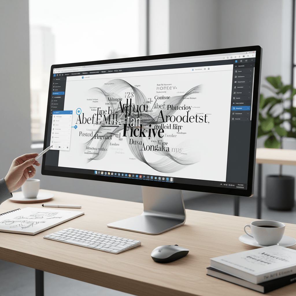
Typography is often an afterthought in web design, but it’s a cornerstone of effective communication and user experience. A website’s typography significantly impacts readability, brand perception, and overall aesthetic appeal. For Elementor users aiming to create visually stunning and highly functional websites, mastering typography is essential. This guide provides a comprehensive overview of advanced typography techniques within Elementor, going beyond the basic settings to help you craft truly exceptional digital experiences.
Whether you’re a seasoned web designer or just starting with Elementor, understanding how to leverage typography can dramatically improve the quality and effectiveness of your websites. We’ll explore everything from fundamental typography principles to advanced Elementor controls, providing practical tips and actionable strategies to elevate your design skills and achieve exceptional results on the CopyElement platform.
Typography’s impact on user experience (UX) is profound. Well-chosen and thoughtfully implemented typography creates a smooth, intuitive reading experience, encouraging users to engage with your content. Conversely, poor typography can lead to frustration, eye strain, and ultimately, users leaving your site. Consider these factors: is the font size large enough? Is the line height appropriate for comfortable reading? Is there sufficient contrast between the text and background? A user struggling to read your content is unlikely to convert. Optimize your Elementor website typography to prioritize readability and accessibility, leading to increased engagement and lower bounce rates. Remember, visual hierarchy, created with font sizes and weights, guides the user through the content. For example, headings should be larger and bolder than body text, and important information should be highlighted with different weights or styles.
Your typography choices directly influence how users perceive your brand. Different fonts evoke different emotions and associations. A classic serif font might convey tradition and reliability, while a modern sans-serif font can communicate innovation and simplicity. The selected font must resonate with the brand’s identity and target audience. A playful script font might be suitable for a children’s website but would likely be inappropriate for a professional financial services site. For CopyElement users, carefully consider the fonts used in your website templates and UI kits. Do they align with your brand messaging? Are they consistent across your website? Subtle adjustments to font weight, style, and spacing can further refine your brand’s visual identity. Furthermore, ensure your typography complements your overall design aesthetic. Clash between font styles and website imagery will create a dissonance that can negatively impact brand perception.
Accessible typography is not just a best practice; it’s often a legal requirement, especially in certain jurisdictions. Websites must be usable by individuals with visual impairments. This means ensuring sufficient contrast between text and background colors, using font sizes that are easily readable, and providing alternative text descriptions for images containing text. Tools like WebAIM’s contrast checker (WebAIM’s contrast checker) can help you verify that your color choices meet accessibility standards. Furthermore, avoid using fonts that are overly stylized or difficult to read. Choose fonts that are clear, legible, and available in various weights and styles. Elementor’s typography controls allow you to adjust these settings easily. Remember that good accessibility improves the user experience for everyone, not just those with disabilities. By prioritizing accessibility, you demonstrate a commitment to inclusivity and ethical design practices. Neglecting accessible typography can result in legal penalties and reputational damage.

Elementor provides intuitive typography controls within its styling options. To access the typography panel, select the element you wish to style (e.g., heading, text, button) and navigate to the “Style” tab. Within the style settings, you’ll find the “Typography” section. Here you can adjust various font properties like font family, size, weight, transform, style, line height, and letter spacing. The typography panel offers real-time previews, allowing you to see the changes as you make them. Take the time to familiarize yourself with each control and its effect on your text. Note that some elements might inherit typography settings from global styles or parent containers. Understanding this inheritance system is crucial for maintaining consistency across your website. The panel allows adjustments across Desktop, Tablet, and Mobile breakpoints, ensuring your typography looks great on all devices.
Elementor offers a wide range of font family options. System fonts are pre-installed on users’ computers, ensuring fast loading times and cross-browser compatibility. However, system fonts can be limiting in terms of design flexibility. Google Fonts provides a vast library of free, open-source fonts that you can easily integrate into your Elementor website. Google Fonts offers more design choices, but can increase page load times if not properly optimized. You can also upload custom fonts in formats like TTF or WOFF if you have a specific brand font or want to use a unique typeface. When choosing a font family, consider its legibility, style, and compatibility with your brand. Use different font families for headings and body text to create visual contrast. Before uploading custom fonts, ensure you have the necessary licenses and optimize them for web use to minimize file sizes and improve performance.
Font size, weight, and transform are essential tools for creating a clear visual hierarchy and emphasizing key information. Use larger font sizes for headings to draw attention and establish the structure of your content. Adjust font weight (e.g., normal, bold, bolder) to highlight important words or phrases. Font transform (e.g., uppercase, lowercase, capitalize) can be used to create a specific visual style or to ensure consistency in your text. Avoid using excessive font weights or transformations, as this can make your text difficult to read. For example, use uppercase sparingly, as it can reduce legibility. Experiment with different font sizes and weights to find the optimal balance between visual impact and readability. Ensure that font sizes are responsive and adapt appropriately to different screen sizes. As a CopyElement user, consider how font size, weight, and transform have been used within our templates to guide users through content, improving the overall user experience. A clear visual hierarchy guides the user’s eye, making it easier to scan and understand the content.
Effective font pairing involves selecting two or more fonts that work well together to create visual interest and improve readability. The primary principles of font pairing are contrast, complementarity, and legibility. Contrast ensures that the fonts are visually distinct, preventing them from blending together and creating a monotonous look. This can be achieved by pairing a serif font with a sans-serif font, or by using fonts with different weights or styles. Complementarity means that the fonts should share some common characteristics, such as similar proportions or x-heights, to create a sense of visual harmony. Legibility is paramount; ensure that both fonts are easy to read, especially for body text. Avoid pairing fonts that are too similar or that clash with each other. Consider the overall tone and style of your website when choosing font pairings. For instance, a professional website might benefit from a classic and elegant font pairing, while a creative website might use more playful and experimental combinations.
Different website niches often benefit from specific font pairings that reflect their brand identity and target audience. Here are some examples using Google Fonts:
These are just a few examples; experiment with different combinations to find what works best for your specific website. Consider using a font pairing tool for inspiration and guidance. Test your font pairings on different devices and browsers to ensure they look consistent across all platforms.
Several tools and resources can help you discover effective font combinations:
These tools can save you time and effort by providing ready-made font combinations or by helping you discover new and interesting pairings. Don’t be afraid to experiment and try out different combinations until you find one that perfectly matches your brand and website design. Remember to prioritize legibility and ensure that the fonts you choose are accessible to all users.
Line height, also known as leading, is the vertical space between lines of text. Optimizing line height is crucial for readability and visual appeal. Insufficient line height can make text feel cramped and difficult to read, while excessive line height can create too much space between lines, disrupting the flow of the text. A general rule of thumb is to use a line height that is approximately 1.5 to 2 times the font size. However, the optimal line height can vary depending on the font family, font size, and the length of the lines. Experiment with different line heights to find what looks best for your specific text. Elementor allows you to adjust line height using the “Line Height” control in the typography panel. Consider the overall layout of your website when choosing line height. For example, a website with narrow columns might benefit from a slightly smaller line height, while a website with wide columns might require a larger line height. Ensure that line height is responsive and adapts appropriately to different screen sizes.
Letter spacing, also known as tracking, is the horizontal space between letters in a word or phrase. Adjusting letter spacing can enhance legibility and create a more polished and modern look. Increasing letter spacing can improve readability for smaller font sizes or for fonts that are tightly spaced. Decreasing letter spacing can create a more compact and condensed look, which can be useful for headings or short phrases. However, excessive letter spacing can make text difficult to read. Elementor allows you to adjust letter spacing using the “Letter Spacing” control in the typography panel. Use letter spacing sparingly and pay attention to the overall visual impact. Consider using different letter spacing for headings and body text. For example, you might use a slightly wider letter spacing for headings to create a more dramatic effect. Ensure that letter spacing is consistent across your website. Remember Elementor SEO: Rank Higher with These Simple Tweaks, by making it easier for users to read your text the better your site’s SEO.
Word spacing is the horizontal space between words in a sentence or paragraph. Controlling word spacing can improve text flow and accessibility, especially for users with dyslexia or other reading disabilities. Increasing word spacing can make text easier to read by providing more visual separation between words. Decreasing word spacing can create a more compact and dense look, but can also make text more difficult to read. Elementor allows you to adjust word spacing using CSS properties (through custom CSS or by using an Elementor addon that extends typography controls). Use word spacing judiciously and pay attention to the overall visual impact. Avoid excessive word spacing, as this can disrupt the flow of the text. Consider the font family and font size when choosing word spacing. For example, a font with narrow letterforms might benefit from slightly increased word spacing. Test your word spacing settings on different devices and browsers to ensure they look consistent across all platforms.
Typography is more than just choosing a font; it’s a critical element of website design that impacts user experience, brand perception, and accessibility. Neglecting typography can lead to a website that is difficult to read, unprofessional looking, and inaccessible to users with disabilities.
Effective typography enhances user experience by making content easy to read and understand. A well-chosen font, appropriate font size, and proper line spacing can significantly improve readability and engagement. Conversely, poor typography can lead to frustration and abandonment. For example, using a font that is too small or difficult to read can deter users from exploring your website. Prioritize readability to ensure a positive user experience and encourage users to spend more time on your site.
Typography plays a crucial role in shaping brand perception. Different fonts evoke different emotions and associations. A modern, sans-serif font might convey a sense of innovation and technology, while a classic, serif font might communicate tradition and elegance. Choose fonts that align with your brand’s personality and values. Consistency in typography across your website and marketing materials reinforces brand recognition and creates a cohesive brand image. A well-thought-out typography strategy can elevate your brand and set you apart from the competition.
Typography is also a key aspect of website accessibility. Users with visual impairments or reading disabilities rely on clear and legible typography to access content. Ensuring sufficient contrast between text and background, using appropriate font sizes, and providing alternative text for images of text are essential for accessibility. Adhering to accessibility guidelines, such as WCAG (Web Content Accessibility Guidelines), is not only a legal requirement in many jurisdictions but also an ethical responsibility. Accessible typography makes your website inclusive and ensures that everyone can access and understand your content. Prioritize accessibility to reach a wider audience and create a more equitable online experience. Learn more about Web Content Accessibility Guidelines (WCAG).
Elementor provides a user-friendly interface for controlling typography on your website. The typography panel offers a range of options for customizing fonts, sizes, weights, line heights, letter spacing, and more. Mastering these controls is essential for creating visually appealing and accessible websites.
The typography panel in Elementor can be found within the “Style” tab of most widgets, including text, heading, and button widgets. Simply select the widget you want to style, navigate to the “Style” tab, and locate the “Typography” section. The typography panel provides controls for selecting font families, adjusting font sizes, choosing font weights, transforming text, styling text (italic/oblique), setting line heights, adjusting letter spacing, and controlling word spacing. Familiarize yourself with each of these controls to unlock the full potential of Elementor’s typography capabilities.
Elementor offers a wide range of font family options, including system fonts, Google Fonts, and custom uploaded fonts. System fonts are pre-installed on users’ computers and ensure consistent rendering across different devices. Google Fonts is a library of free, open-source fonts that can be easily integrated into your website. Custom fonts allow you to use unique and branded fonts that are not available in system fonts or Google Fonts. To add a custom font, you will need to upload the font file (e.g., .woff, .woff2) to your WordPress media library and then add the appropriate CSS code to your Elementor website. Choose font families that align with your brand’s identity and ensure they are legible and accessible.
Font size, weight, and transform are essential for creating a clear visual hierarchy on your website. Font size determines the size of the text, while font weight determines the thickness of the text. Transform allows you to change the capitalization of the text (e.g., uppercase, lowercase, capitalize). Use larger font sizes and heavier font weights for headings to make them stand out from the body text. Use transform to create consistent capitalization across your website. For example, you might use uppercase for all headings or capitalize the first letter of each word. Experiment with different font sizes, weights, and transforms to create a visually appealing and easy-to-navigate website.
Choosing the right font pairings is crucial for creating a visually harmonious and professional-looking website. Combining different fonts can add visual interest and enhance the overall aesthetic of your website. However, pairing fonts incorrectly can create a jarring and confusing experience for users.
When pairing fonts, consider the principles of contrast, complementarity, and legibility. Contrast refers to the degree of difference between two fonts. Pairing a serif font with a sans-serif font can create visual contrast and make the website more engaging. Complementarity refers to how well two fonts work together. Choose fonts that have similar proportions and styles. Legibility is the most important factor to consider when pairing fonts. Ensure that both fonts are easy to read and do not clash with each other. A good rule of thumb is to use one font for headings and another font for body text.
Here are a few recommended font pairings for different website niches, using Google Fonts:
Experiment with different font pairings to find the perfect combination for your website.
There are several tools and resources available to help you discover effective font combinations. FontPair is a website that showcases various font pairings and allows you to preview them. Google Fonts also provides suggestions for font pairings. Adobe Fonts offers a curated collection of high-quality fonts and font pairings. Additionally, online design communities and forums can provide inspiration and feedback on your font choices. Some popular examples include FontPair and the Google Fonts directory itself.
Beyond basic font selection and sizing, Elementor provides advanced typography controls to further refine the look and feel of your text. These controls include line height, letter spacing, and word spacing, which can significantly impact readability and visual appeal.
Line height, also known as leading, refers to the vertical space between lines of text. Adjusting line height can greatly improve readability. Insufficient line height can make text feel cramped and difficult to read, while excessive line height can create a disjointed appearance. A general rule of thumb is to set the line height to 1.5 times the font size. Elementor’s typography panel allows you to adjust the line height using a numerical value or a relative unit like “em.” Experiment with different line heights to find the optimal setting for your chosen font and content.
Letter spacing, also known as tracking, refers to the horizontal space between individual letters. Increasing letter spacing can enhance legibility, especially for smaller font sizes or condensed fonts. It can also create a more modern and airy look. However, excessive letter spacing can make the text appear disjointed and difficult to read. Elementor allows you to adjust letter spacing using a numerical value. Subtle adjustments to letter spacing can have a significant impact on the overall visual appearance of your text.
Word spacing refers to the horizontal space between individual words. Adjusting word spacing can improve text flow and readability, especially for longer paragraphs or narrow columns. Too little word spacing can make the text feel crowded, while too much word spacing can disrupt the reading rhythm. Elementor allows you to adjust word spacing using a numerical value. Be mindful of accessibility guidelines when adjusting word spacing, as excessive spacing can make it difficult for users with certain disabilities to read the text. Aim for a balanced and consistent word spacing that enhances readability without sacrificing visual appeal.
Responsive typography is critical for delivering a seamless user experience across all devices. A website with poorly adjusted typography on mobile or tablet can lead to high bounce rates and frustrated users. Elementor provides several tools to ensure your text is readable and visually appealing, regardless of screen size.
Elementor’s responsive settings allow you to customize font sizes for desktop, tablet, and mobile devices independently. To do this, select the text element you want to modify, go to the “Style” tab, and then navigate to the “Typography” section. You’ll see icons for desktop, tablet, and mobile next to the “Size” setting. Click on each icon to adjust the font size specifically for that device. A good starting point is setting a base font size for desktop (e.g., 16px), then reducing it slightly for tablets (e.g., 14px) and even further for mobile (e.g., 12px or 13px). Remember to also adjust line height and letter spacing for each device to optimize readability. Neglecting to customize these settings will often result in text that is too small on mobile or too large on desktop, both of which are detrimental to user experience.
Viewport units offer a dynamic way to manage font sizes that scale proportionally to the screen size. “vw” (viewport width) and “vh” (viewport height) allow text to resize automatically as the screen size changes. For instance, setting a font size to “2vw” means the text will occupy 2% of the viewport’s width. While powerful, viewport units require careful consideration. Overuse can lead to text that becomes excessively large on very wide screens or too small on very narrow screens. It’s best to use viewport units in conjunction with Elementor’s responsive settings to set minimum and maximum font sizes, preventing extreme scaling. To use viewport units, enter the value (e.g., 2vw) directly into the font size field within Elementor’s typography settings.
After implementing responsive typography adjustments, thorough testing is essential. Elementor’s built-in responsive mode allows you to preview your website on different screen sizes directly within the editor. However, it’s also crucial to test on actual devices to ensure accurate representation. Use browser developer tools to simulate various screen resolutions and device types. Pay close attention to how text wraps, overlaps with other elements, and maintains readability. Consider using a service like BrowserStack to test across a wide range of real devices and operating systems. Iterate on your typography settings based on these tests, fine-tuning font sizes, line heights, and letter spacing until you achieve optimal legibility and visual harmony across all devices. Remember that user experience is paramount; a website that looks and reads well on all devices will encourage longer engagement and reduce bounce rates.
Typography plays a crucial role in both user experience and SEO. Well-structured content with clear typography not only improves readability but also helps search engines understand the hierarchy and relevance of your information. Proper use of heading tags and semantic HTML provides context to search engines, while visually appealing typography keeps readers engaged, which can improve dwell time and reduce bounce rate. Optimizing typography for both search engines and readers is an essential aspect of Elementor SEO.
Semantic HTML tags like H1–H6, p, strong, and em provide structure and meaning to your content. Heading tags (H1–H6) define the hierarchy of your content, with H1 representing the main title and subsequent tags representing subheadings. The p tag is used for paragraphs, strong for emphasizing important text, and em for italicized emphasis. Using these tags correctly not only improves SEO but also enhances accessibility for users with screen readers. Elementor’s text editor makes it easy to apply these tags to your content. When creating a new heading, use the “HTML Tag” dropdown in the “Content” tab to select the appropriate heading level (H1-H6). For paragraphs and other text elements, use the text editor to apply strong and em tags as needed. Avoid using heading tags solely for styling purposes; instead, use CSS to style your headings while maintaining semantic accuracy. It is important to have only one H1 tag per page, representing the main topic of the content.
Headings are critical for both SEO and user experience. They provide a clear roadmap for readers and help search engines understand the topic and subtopics of your content. Optimize your headings by including relevant keywords that accurately reflect the content of each section. However, avoid keyword stuffing, which can negatively impact your SEO. Instead, focus on creating natural, conversational headings that are both informative and engaging. For example, instead of using a generic heading like “Typography,” consider a more specific and keyword-rich heading like “Advanced Typography Techniques for Elementor Websites.” Aim for clarity and conciseness; headings should clearly communicate the content of the section in a few words. Using question-based headings can also be effective for engaging readers and addressing their specific queries.
A clear visual hierarchy guides users through your content and helps them quickly identify the most important information. This is achieved through a combination of font sizes, font weights, colors, and spacing. The H1 heading should be the largest and most prominent element on the page, followed by H2, H3, and so on, in decreasing size and importance. Use font weight to emphasize key headings and subheadings. For example, use a bold font weight for H2 headings to differentiate them from H3 headings. Color can also be used to create visual interest and highlight important elements, but use it sparingly and consistently. White space (or negative space) is equally important; it provides breathing room around text and helps to separate different sections of content. Ensure that there is sufficient spacing between headings, paragraphs, and other elements to improve readability. A well-defined visual hierarchy not only improves user engagement but also reduces bounce rate, as users are more likely to stay on your page if they can easily find the information they are looking for. Good UI/UX design principles often focus on typography to guide the user’s eyes.
While Elementor provides extensive typography options, custom CSS offers even greater control and flexibility. By adding custom CSS to your Elementor website, you can create unique text effects, apply custom fonts, and target specific elements for precise typography control. This allows you to achieve a truly bespoke look and feel that aligns with your brand identity. Understanding CSS selectors and properties is essential for effectively using custom CSS.
The @font-face rule allows you to use custom fonts that are not included in Elementor’s default font library. To add a custom font, you’ll need to upload the font files (e.g., .woff, .woff2, .ttf) to your WordPress media library or a dedicated font directory. Then, use the @font-face rule in your custom CSS to define the font family and specify the location of the font files. For example:
@font-face {

font-family: 'MyCustomFont';

src: url('path/to/mycustomfont.woff2') format('woff2'),

url('path/to/mycustomfont.woff') format('woff');

font-weight: normal;

font-style: normal;

}
Replace ‘MyCustomFont’ with the desired font family name and ‘path/to/mycustomfont.woff2’ and ‘path/to/mycustomfont.woff’ with the actual URLs of your font files. Once you’ve defined the font family, you can apply it to any text element in Elementor using the “Custom CSS” option or by targeting specific elements with CSS selectors. Using custom fonts can enhance your website’s branding and create a unique visual identity. However, be mindful of font licensing and ensure that you have the necessary rights to use the fonts on your website. Also, optimize your font files for web use to minimize their size and improve page load speed. Consider using font formats like WOFF2, which offer better compression and performance.
Custom CSS allows you to create various text effects, such as gradients, shadows, and animations, to enhance the visual appeal of your typography. To add a text gradient, use the background-clip: text; and -webkit-background-clip: text; properties in combination with a linear or radial gradient. For example:
.element {

background: linear-gradient(to right, #ff0000, #0000ff);

-webkit-background-clip: text;

background-clip: text;

color: transparent;

}
To add a text shadow, use the text-shadow property. For example: text-shadow: 2px 2px 4px rgba(0, 0, 0, 0.5); This creates a subtle shadow effect that adds depth to the text. For more advanced text effects, such as animations, you can use CSS transitions and keyframes. For example, you can create a pulsating text effect by animating the opacity or transform property. When creating text effects, avoid overuse, as excessive effects can distract from the content and negatively impact user experience. Use these effects sparingly and strategically to highlight important elements or create visual interest. Always test your text effects on different devices and browsers to ensure compatibility and optimal performance.
CSS selectors allow you to target specific elements on your page and apply custom typography styles. Elementor assigns CSS classes and IDs to its elements, which you can use to target them with CSS selectors. For example, if you want to change the font size of all H2 headings within a specific section, you can use a CSS selector like .elementor-section h2 { font-size: 24px; }. The .elementor-section class targets the section element, and the h2 selector targets all H2 headings within that section. You can also use more specific selectors, such as element IDs, to target individual elements. Elementor allows you to assign custom CSS classes to elements, which can be useful for applying unique typography styles to specific elements. For example, you can assign a class of “custom-heading” to a specific H2 heading and then use the selector .custom-heading { font-family: 'MyCustomFont'; } to apply a custom font to that heading. Understanding CSS selectors is essential for precise typography control in Elementor. Use browser developer tools to inspect the HTML structure of your page and identify the appropriate CSS classes and IDs to target. Always test your CSS selectors to ensure that they are targeting the correct elements and applying the desired styles.
Even with Elementor’s user-friendly interface, it’s easy to make typography mistakes that can negatively impact readability and user experience. Avoiding these common pitfalls can significantly improve the overall design and effectiveness of your website. Paying attention to font choices, consistency, and contrast is key to creating a visually appealing and accessible website.
Decorative fonts can add personality and flair to your website, but overusing them can severely hinder readability. These fonts are often designed for headings or short text elements, not for long paragraphs of content. When used excessively, decorative fonts can strain the eyes and make it difficult for users to read and comprehend the text. The key is to use decorative fonts sparingly and strategically. Reserve them for headings, subheadings, or short call-to-action phrases. For body text, always choose a clean, legible font that is designed for readability. Common choices for body text include sans-serif fonts like Arial, Helvetica, and Open Sans, or serif fonts like Times New Roman, Georgia, and Palatino. When selecting decorative fonts, ensure that they are still legible at the intended size and that they complement the overall design of your website. If readability is compromised, opt for a simpler, more legible font.
Inconsistent font usage can create a disjointed and unprofessional look. Using too many different fonts on a single page or throughout your website can confuse users and detract from the overall design. Stick to a limited number of fonts (typically two or three) and use them consistently across your website. Choose one font for headings and another for body text. If you need a third font, reserve it for special elements like call-to-action buttons or quotes. Ensure that the fonts you choose complement each other and align with your brand identity. Using a consistent font palette helps to create a cohesive and professional look that reinforces your brand message. Elementor’s theme styles can help you define default fonts for headings and body text, ensuring consistency across your website. Avoid using different fonts for similar elements on different pages, as this can create a jarring experience for users.
Insufficient contrast between text and background colors can make it difficult for users to read your content, especially those with visual impairments. Text should always be easily distinguishable from the background color. Use a color contrast checker tool to ensure that your text and background colors meet accessibility standards. The Web Content Accessibility Guidelines (WCAG) recommend a contrast ratio of at least 4.5:1 for normal text and 3:1 for large text. Avoid using light text on a light background or dark text on a dark background. If you’re using a dark background, use light-colored text to ensure sufficient contrast. Similarly, if you’re using a light background, use dark-colored text. Be mindful of color combinations; some color combinations can be difficult to read, even with sufficient contrast. For example, avoid using red and green together, as this combination can be problematic for people with color blindness. Test your website on different devices and browsers to ensure that the text is legible in all environments. Addressing poor contrast improves user experience and meets accessibility requirements, making your website more inclusive and user-friendly.
Small Business Growth: Beyond the Website with 610 Digital can help with SEO.
Website accessibility is paramount. Ensure your Elementor typography choices cater to users with visual impairments and other disabilities. Accessibility isn’t just a nice-to-have; it’s crucial for ethical design and legal compliance in many regions.
Color contrast is vital for readability. Insufficient contrast makes it difficult, if not impossible, for some users to read your text. Use a color contrast checker (many are available online) to verify that your text meets WCAG (Web Content Accessibility Guidelines) standards. Aim for a contrast ratio of at least 4.5:1 for normal text and 3:1 for large text (18pt or 14pt bold). Consider the color blindness of some users when making your choices. Avoid pairing colors that are indistinguishable to people with color deficiencies. Elementor’s color picker can help you select accessible color combinations. If you’re unsure, err on the side of higher contrast. The larger the text, the more forgiving the contrast can be.
Images containing text, while visually appealing, are inaccessible to screen readers unless you provide appropriate alternative text (alt text). The alt text should accurately describe the text within the image. If the image is purely decorative and the text is already present elsewhere on the page, use an empty alt attribute (alt=””) to signal to screen readers to ignore the image. Don’t simply repeat the text in the alt text; provide context if necessary. For example, if an image shows a testimonial quote, the alt text could be “Testimonial quote from John Smith regarding product benefits.” This provides more valuable information to screen reader users. Remember that alt text is also beneficial for Elementor SEO.
Screen readers rely on semantic HTML to understand the structure of your content. Use heading tags (<h2>, <h3>, etc.) in a logical order to create a clear hierarchy. Don’t use heading tags purely for styling purposes; use CSS to modify the appearance of your text. Use lists (<ul>, <ol>) for listing content instead of manually adding bullet points or numbers. These HTML elements give vital information to screen readers. Ensure all links have descriptive anchor text, so users know where the link will take them. Avoid generic link text like “Click here.” Instead, use the title of the linked page or a clear description of its content. Consider using ARIA attributes to enhance accessibility further for complex Elementor layouts, but only when necessary and with careful planning.
Let’s explore some hypothetical examples of websites built with Elementor that showcase exceptional typography. Analyze their font choices, hierarchy, and overall impact on user experience.
High-converting landing pages often employ a strategic combination of typography. Typically, they use a prominent, attention-grabbing font for headlines to immediately convey the value proposition. Body text is usually set in a highly readable font, often a sans-serif typeface, to encourage engagement. The font sizes are carefully chosen to create a clear visual hierarchy, guiding the user’s eye to key information and ultimately to the call to action. Consider a landing page for a SaaS product. The headline might use a bold, modern font like Montserrat, while the body text utilizes Open Sans for optimal readability. The CTA button would use a contrasting color and a slightly larger font size to make it stand out. Color psychology and landing page conversion are heavily linked.
Typography choices should align with the brand identity and target audience. An e-commerce website might use a combination of clean, modern fonts for product descriptions and more expressive fonts for promotional banners. A portfolio website, on the other hand, might prioritize unique and creative font pairings to showcase the designer’s personality and style. Think about an online clothing store. They might use a classic serif font like Garamond for product titles to convey a sense of luxury and elegance. In contrast, a tech startup’s website might opt for a futuristic sans-serif font like Roboto to project innovation and modernity. The key is to understand the psychological impact of different fonts and use them strategically.
Analyze award-winning websites built with Elementor to identify common typography trends and best practices. Pay attention to how these websites use whitespace, line height, and letter spacing to enhance readability. Examine the use of custom fonts and the overall visual harmony of the typography. Many award-winning sites prioritize simplicity and clarity, opting for a minimalist typography approach that focuses on delivering a clear and concise message. They also often employ responsive typography techniques to ensure optimal readability across all devices. By studying these examples, you can gain valuable insights into how to create visually stunning and highly effective typography for your own Elementor websites. You can also draw inspiration from Elementor UI Kits to kickstart your designs.
Typography plays a crucial role in influencing user behavior and driving conversions. Optimizing your call-to-action (CTA) typography can significantly increase click-through rates and ultimately boost your bottom line.
CTAs need to stand out from the rest of your website content. Use contrasting colors that grab the user’s attention without being jarring. Experiment with different font weights to create visual emphasis. A bold font weight can make your CTA text more prominent and encourage users to click. Avoid using the same color palette as your background. Instead, use complementary or contrasting colors to make the CTA pop. Test different color combinations to see which ones perform best with your target audience. You can A/B test different typography options using Elementor’s built-in testing features.
The text on your CTA button should be clear, concise, and action-oriented. Use strong verbs that tell users exactly what they’ll get when they click the button. Avoid ambiguous or vague language. Examples include “Get Started Now,” “Download Your Free Ebook,” or “Request a Quote.” Keep the text short and sweet, ideally no more than a few words. This will ensure that the button text is easily readable and understandable, even on small screens. Ensure there is sufficient padding around the text to make the button more clickable.
Mobile devices require special attention when it comes to CTA typography. Ensure that your CTA buttons are large enough to be easily tapped on mobile screens. Use responsive typography techniques to adjust the font size and line height for optimal readability on different devices. Avoid using overly complex or decorative fonts that may not render well on smaller screens. Test your CTA buttons on different mobile devices to ensure they are working correctly and are visually appealing. Consider using a larger font size and a more prominent button design for mobile users to maximize click-through rates.
The world of web typography is constantly evolving. Stay ahead of the curve by embracing emerging trends and adopting best practices for 2026 and beyond.
Keep an eye on variable fonts, which offer greater flexibility and control over font styles. Pay attention to the use of AI in typography, which can help you automate font selection and optimization. Explore the potential of motion typography to add dynamism and visual interest to your websites. Accessibility will continue to be a major focus, so prioritize inclusive design practices. By staying informed and adapting to these changes, you can ensure that your Elementor typography remains cutting-edge and effective.
Effective typography goes beyond aesthetics. It’s about creating a user experience that is both visually appealing and highly functional. By following these tips and staying up-to-date on the latest trends, you can unlock the full potential of Elementor typography and create websites that truly stand out.
For further exploration and a vast library of ready-to-use components and templates to enhance your typography implementation, visit blog.copyelement.com, your go-to resource for building exceptional websites with Elementor.


